

All Charts are Annual maps.
PNC…this name was an oversight in DMI. The chart shows this has been the best financial to own since 2008.

Yra peaked my curiosity.
Spu/Bonds…this line chart goes back to the start of the new 30 Yr. Bonds in 1997. You can see the new high it’s making.
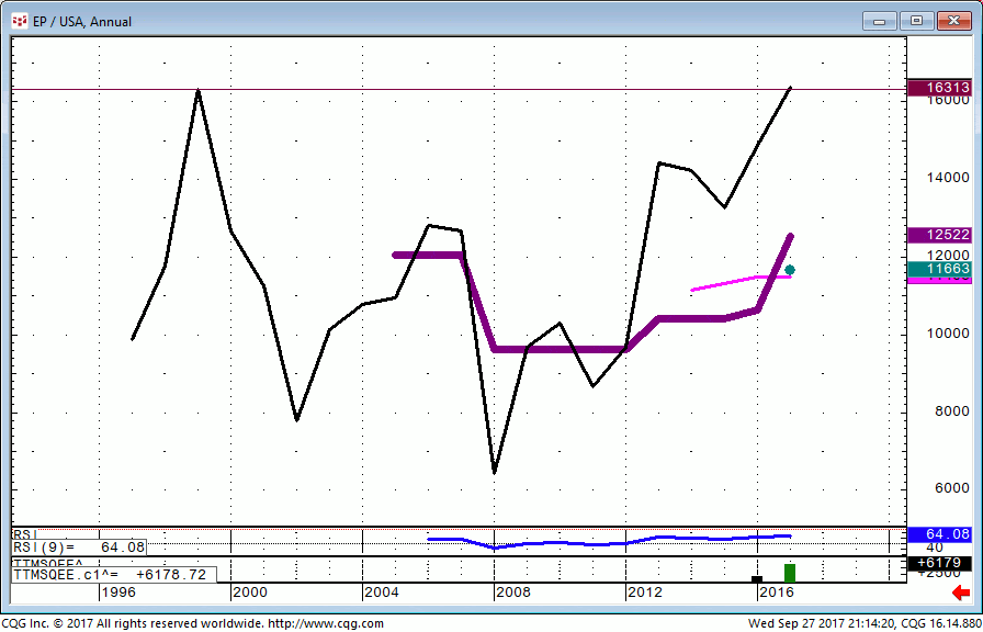
Spu/Bonds…You can see the spreadBar only pulls data to 2014 so I never bother to pull it upon a regular basis.
Looking at last years ORH with follow through, you’d anticipate a strong finish to the year.
I will contact CQG today to see if there is any way to pull the data going back to 1982. It would be helpful in measuring upside extensions.

SMH…yearly Semiconductor ETF. 92 was the opening range of the contract 5/5/2000 closing that day @ 92.56.
92 is Macro resistance and the upside closing pivot

Nasd 100…. let’s look at the Nasd 100. You can see how the opening range of the contract was pivotal in both directions.
It capped the rally in Nasdaq for a decade. It was the 2007 high and the upside breakout level in 2011/12.
I’m showing this so you can get a sense of how big and impactful 92 can turn out to be in the Semi’s.

AUD/USD…In 2011 I had a resting order to sell Aussie @ 110.97.
Then, like earlier in the week when I had sell orders working @ 155.07-10 and did not get filled, I was a Total nob and did not fire off A market order to get on board.
Bottom line, opening range levels are important whether it be a stock, commodity or currency!

FB…qtrly you can see the opening range effect here as well. Pull up a weekly or monthly if you care to drill down.

It doesn’t matter what the instrument is. The price action is always similar.
It’s a good rule of thumb whether you trade pig manure or pigs ears, it acts the same.
Markets have memory. These are scene of the crime #’s.
That is my 2 cents worth for the day.